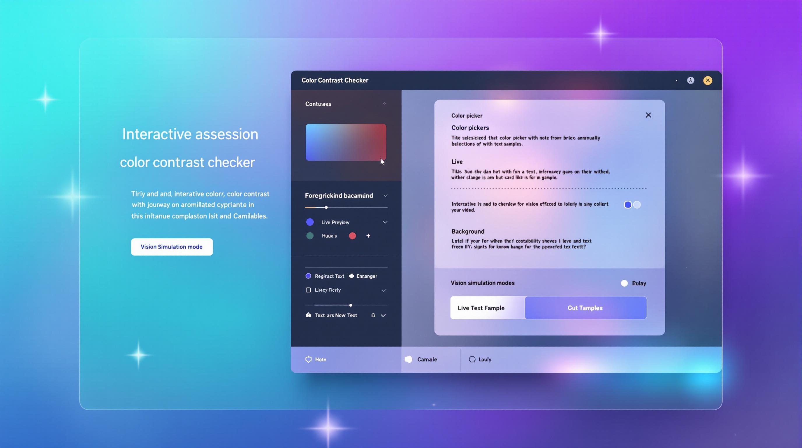
Make Your Website Accessible with Our Free Color Contrast Checker
Discover how to create inclusive designs that everyone can enjoy - no technical skills required!
Have you ever visited a website where the text was almost impossible to read against the background? Maybe you had to squint or zoom in just to make out the content? I know I have - and it's frustrating!
This isn't just about aesthetics. For millions of people with visual impairments, poor color contrast can completely block access to information. That's why I created a free, easy-to-use Color Contrast Checker that helps you create websites everyone can enjoy.
In this post, I'll show you how this tool can transform your approach to web design and why accessibility should be at the heart of your creative process.
Why Color Contrast Matters More Than You Think
Imagine trying to read light gray text on a white background on a sunny day. Tough, right? Now imagine you're one of the 300 million people worldwide with color vision deficiency. What might be slightly inconvenient for some becomes completely inaccessible for others.
"Good design is inclusive design. When we make things accessible for people with disabilities, we make them better for everyone."
But here's the amazing part - when you improve your color contrast, everyone benefits:
- Mobile users trying to read your content in bright sunlight
- Older visitors whose eyesight isn't what it used to be
- People with perfect vision who appreciate comfortable reading experiences
- Your SEO rankings since Google prioritizes accessible websites
The WCAG Standard Explained Simply
You've probably heard of WCAG (Web Content Accessibility Guidelines) but might find the technical details overwhelming. Let me break it down:
WCAG measures the luminance contrast ratio between text and background colors. Think of it like measuring how much a mountain stands out against the sky - the greater the difference, the easier it is to see.
The magic numbers to remember are:
AA Standard (Minimum)
For normal text, you need at least a 4.5:1 contrast ratio. This is like making sure your text is clearly visible to most people in normal lighting conditions.
AAA Standard (Enhanced)
For the best experience (especially for visually impaired users), aim for a 7:1 ratio. This ensures readability even in challenging conditions.
Introducing Your New Design Assistant
Creating accessible designs shouldn't require a degree in color theory. That's why I built a free tool that does the heavy lifting for you. Here's what it can do:
Smart Color Analysis
Just pick your text and background colors - our tool instantly calculates the contrast ratio and tells you if it meets accessibility standards.
Color Blindness Preview
See your design through the eyes of people with different types of color vision deficiencies. It's eye-opening!
Accessible Alternatives
If your colors don't pass, get smart suggestions for accessible alternatives with one click.
Save Your Palettes
Found the perfect accessible color scheme? Save it for later so you never lose your favorite combinations.
How to Use the Color Contrast Checker: A Simple Guide
Pick Your Colors
Use the color pickers to select your text and background colors. Don't worry about formats - we accept HEX, RGB, and HSL values!
Get Instant Feedback
See your contrast ratio immediately. Our tool clearly shows if you meet AA or AAA accessibility standards with pass/fail indicators.
Preview Your Design
See exactly how your text will look on the background. This visual preview helps you make design decisions with confidence.
Explore & Save
Try our color suggestions, check different color blindness views, and save your favorite accessible combinations for future projects.
Real Benefits You'll Experience
Since implementing this tool in my own workflow, I've noticed remarkable improvements:
- Reduced bounce rates: Visitors stay longer when they can actually read your content
- Higher conversion rates: Accessible forms mean fewer abandoned purchases
- Peace of mind: No more worrying about accessibility lawsuits or complaints
- Creative freedom: Discover beautiful color combinations you might never have tried
One client told me: "I thought accessible design meant boring design. Now I have beautiful websites that work for everyone!"
Beyond Compliance: The Human Impact
Let me share a quick story. My cousin Mark has color blindness. For years, he struggled with websites that used red/green indicators or low-contrast text. When I showed him a site I'd designed using this tool, his face lit up. "I can actually read everything without zooming!" he said.
That moment reminded me that accessibility isn't about checking boxes - it's about real people with real needs. Every time you improve your color contrast, you're removing barriers for:
- The senior citizen trying to read medical information
- The parent shopping online while rocking a baby
- The student researching in a sunny courtyard
- The professional with temporary vision issues from eye strain
Ready to Transform Your Website?
Creating accessible websites doesn't have to be complicated or time-consuming. With our free Color Contrast Checker, you can:
- Ensure your content is readable for all visitors
- Meet WCAG standards without frustration
- Discover beautiful, accessible color palettes
- Save time with our smart suggestions
- Build websites that truly work for everyone
Best of all, it's completely free and easy to use right here on Blogger!
Try the Color Contrast Checker NowNo signup required - just immediate accessibility improvements
Your Next Steps
I challenge you to test your current website colors today. You might be surprised at what you discover! If you find areas that need improvement, our tool will guide you through fixing them step-by-step.
Have questions about color accessibility? Share them in the comments below - I'd love to help you create more inclusive designs!


